Project Overview
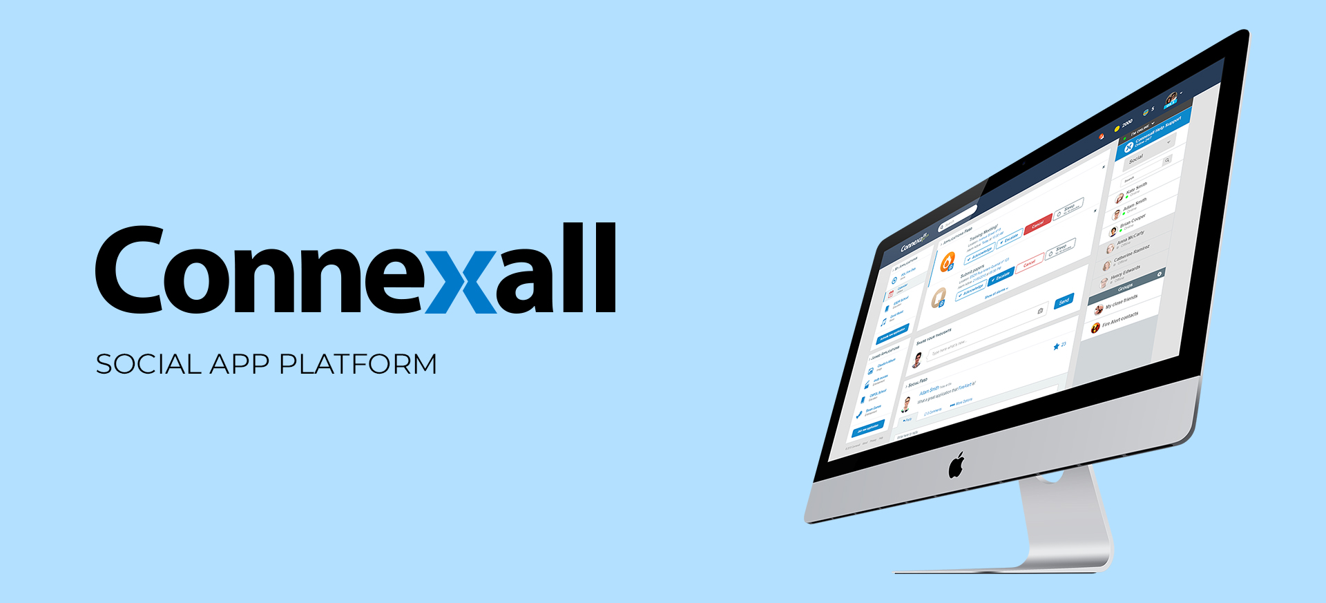
Connexall, renowned for its software managing notifications in healthcare, primarily serves hospitals in Canada and the United States. Catering to the needs of nurses, doctors, and management personnel, Connexall ensures the efficient handling of critical alerts and notifications from diverse hardware, such as health monitors.
My journey with Connexall began when I was entrusted with a unique challenge: to steer the company's expertise into uncharted social territory. The task was to spearhead the creation of a social network, diverging from the traditional healthcare focus. The envisioned platform aimed to empower users, facilitating the sharing of news, ideas, photos, and more, seamlessly integrating with everyday apps.
Role
Product Designer | Feb 2015 - Jul 2017
As the primary Product Designer, I embarked on this journey as the sole design visionary for over half a year, overseeing a project that ventured beyond Connexall's established healthcare domain. My multifaceted role encompassed a spectrum of responsibilities, including research, wireframing, interface design, prototyping, typesetting, iconography, and even delving into front-end development.
Team of 2 designers and 3 developers
Challenge
Navigating Connexall's Expansion: Transitioning from a healthcare-oriented platform to a social network with a broader focus posed a significant challenge. Connexall, an established brand deeply rooted in healthcare, sought to diversify its offerings. The task was no small feat, considering the tight deadlines, the complexity of developing multiple apps, each catering to different user targets and personas.
My role as a Product Designer in this transition required not only creative innovation but strategic thinking. The challenge lay in seamlessly merging Connexall's existing reputation in healthcare with the exploration of new social components and everyday applications. This endeavor demanded adaptability and creative problem-solving, further intensified by the need to meet deadlines and cater to diverse user needs across various applications.
The Process
Embarking on the Connexall project, I initiated a comprehensive design process aimed at navigating the complexities of transitioning from healthcare-focused notifications to a groundbreaking social network. As the sole Product Designer for an extended period, my role extended from conceptualization to implementation, encompassing a series of distinct stages.
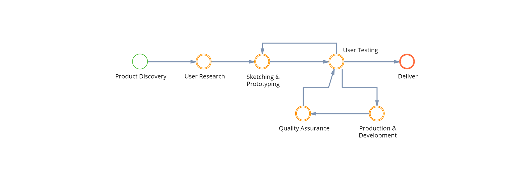
1 - Product Discovery
Brainstorming
Commencing the Connexall project, the initial phase focused on product discovery through intensive brainstorming sessions. Joining forces with the project owner, who was based in Canada, we engaged in regular Skype meetings to unravel the core ideas and intentions behind the project.
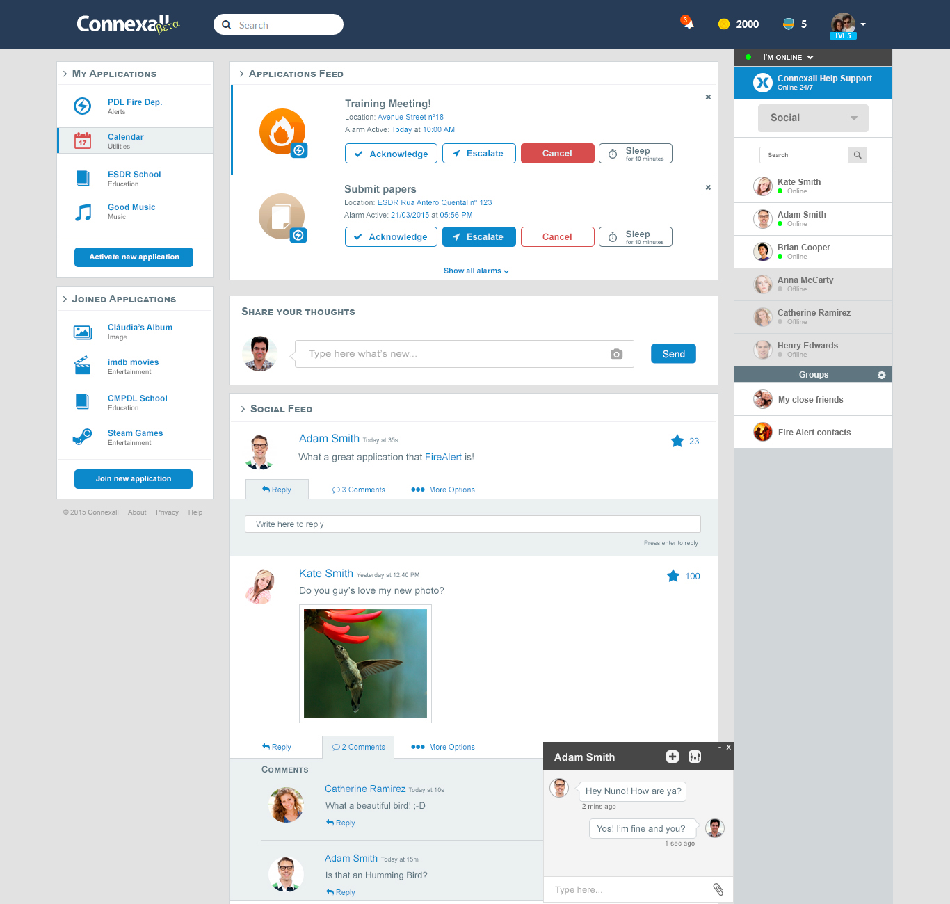
The outcome of these brainstorming sessions materialized into a visionary concept: a global top menu facilitating basic navigation, a profile area on the right suggesting apps based on user interactions, and a left-side list of apps. The central area, contingent on content, featured a special app notification feed atop a news/post feed on the landing/dashboard page.
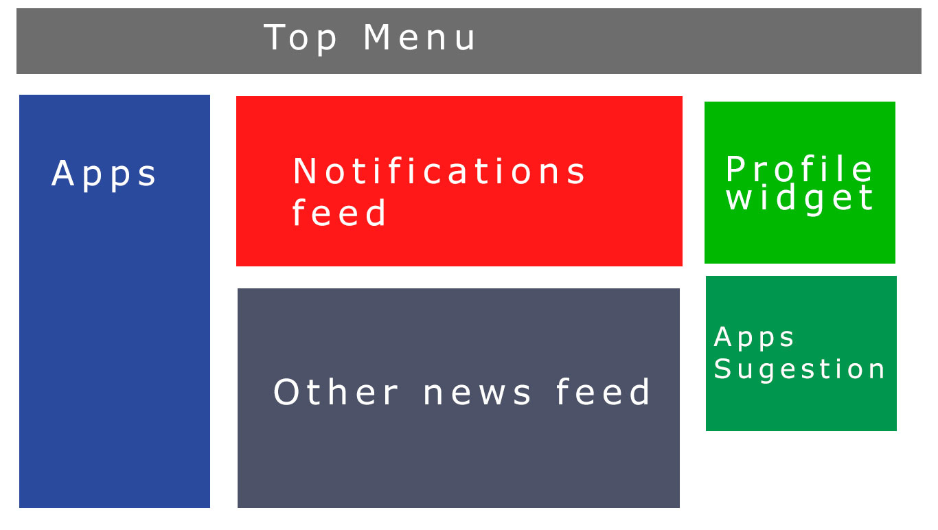
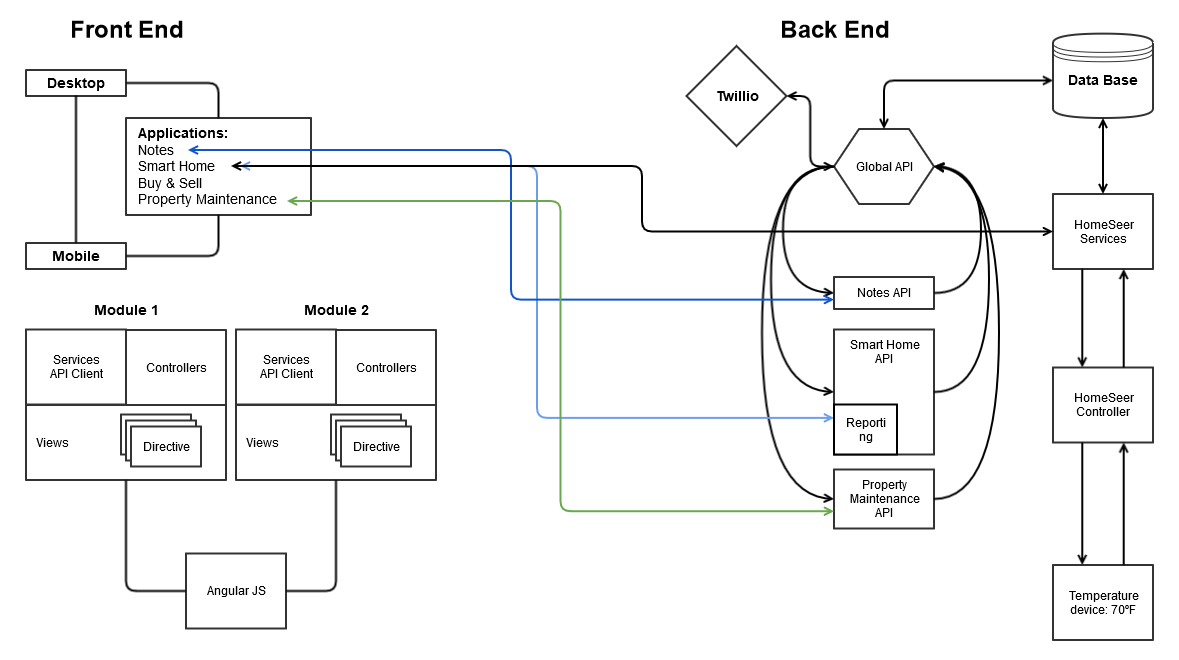
This foundational brainstorming laid the groundwork for a platform divided into two sections: a base social platform and various applications. Despite the diverse content and user targets, the decision was made to share the same backend and maintain a consistent product structure.
2 - User Research
SWOT Analysis
Acknowledging the constraints of time and budget, the user research phase was strategically approached to align with the project's requirements. While extensive user research wasn't feasible, leveraging my background with an MBA, I advocated for a market research initiative accompanied by a SWOT analysis.
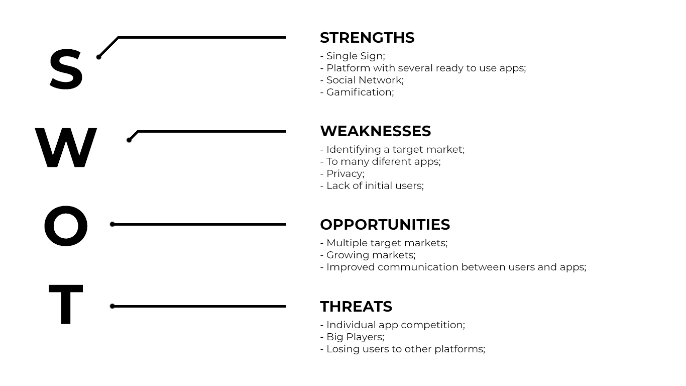
This decision aimed to grasp insights into the competitive landscape and potential stress points, leveraging available online resources. Despite the limited scope, this strategic move provided essential contextual information. In an ideal scenario with more time and resources, a more in-depth user target survey could have enriched our understanding of user preferences and enhanced the overall user experience.
3 - Sketching & Prototyping
Building the idea
With a clear vision from the product discovery phase, the next step involved transforming ideas into tangible concepts through sketching and prototyping. Initiating this creative phase, I began by sketching ideas on paper, presenting the best concepts to the development and management team using a collaborative whiteboard approach.
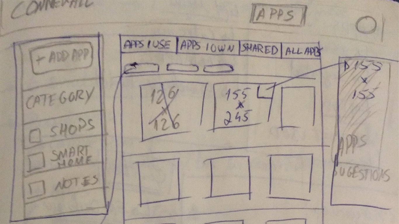
In essence, the concept focused around empowering users to construct their own apps effortlessly. This was achieved by enabling the activation of pre-made apps, customizable to individual preferences. Additionally, users could join apps customized by friends within the social network, fostering collaboration and community engagement.
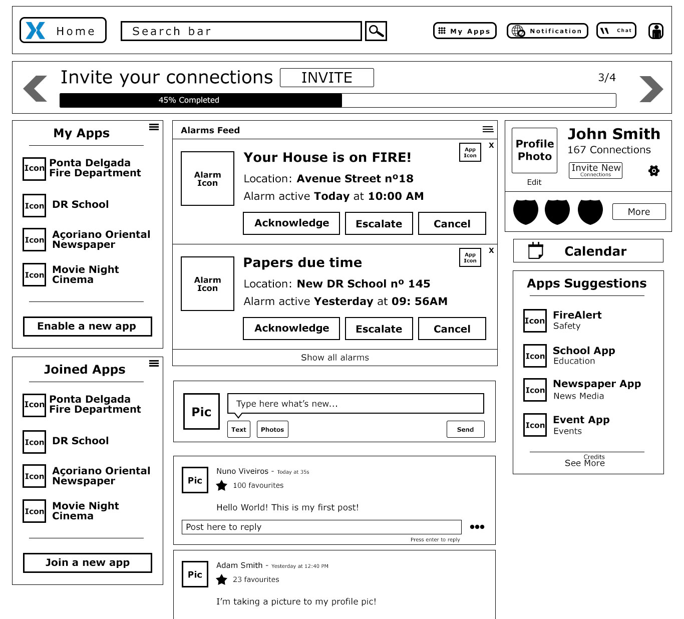
To translate these concepts into tangible visuals and explore various design ideas, wireframes were created using tools like Photoshop and Ninjamock. As wireframes have limitations when it comes to user comprehension, an HTML/CSS prototype was developed. This not only facilitated internal team understanding but also served as a dynamic tool for showcasing the platform's functionality to the project owner and potential investors.
4 - User Testing
Validation and testing undone
Despite recognizing the pivotal role of user testing, constraints in time, budget, and confidentiality led to the omission of this critical step for the overarching project. However, it's noteworthy to mention that during the development of the smart home app, a sample of users was invited to participate in user testing. This involved providing them with a list of tasks and recording their interactions with the prototype. The insights gained from this process unveiled valuable stress points, contributing to an enhanced understanding of user needs.
Regrettably, this user testing initiative was confined to the development phase of the smart home app and wasn't extended throughout the broader project. Underestimating the importance of a comprehensive user testing strategy had unintended consequences, impacting not only the project's overall outcome but also hindering the identification and resolution of potential issues that user testing could have illuminated.
5 - Production and Development
From sketches and wireframes into high-fidelity
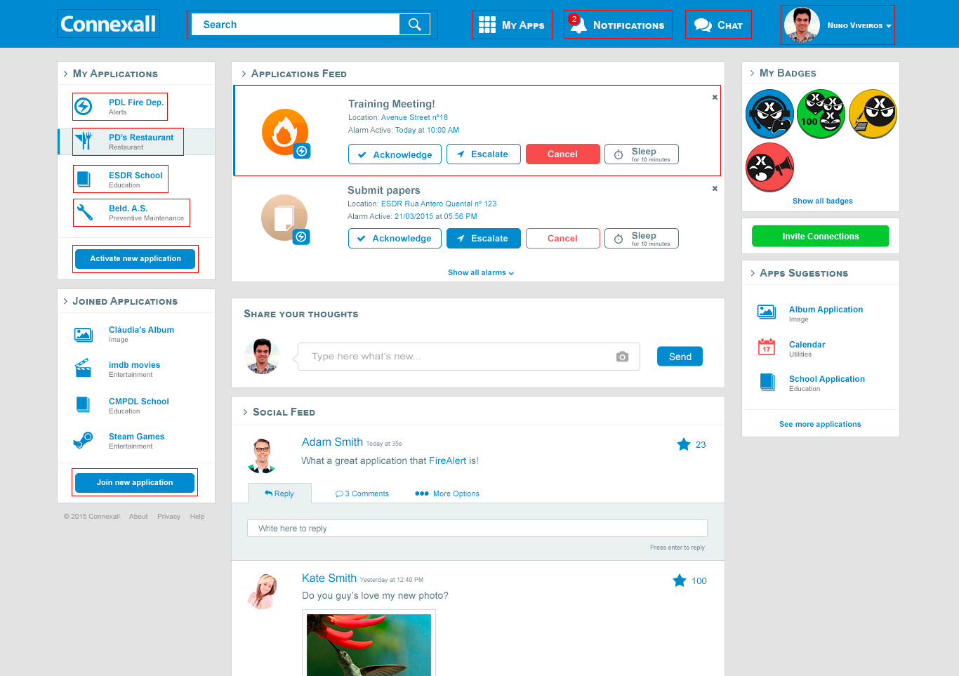
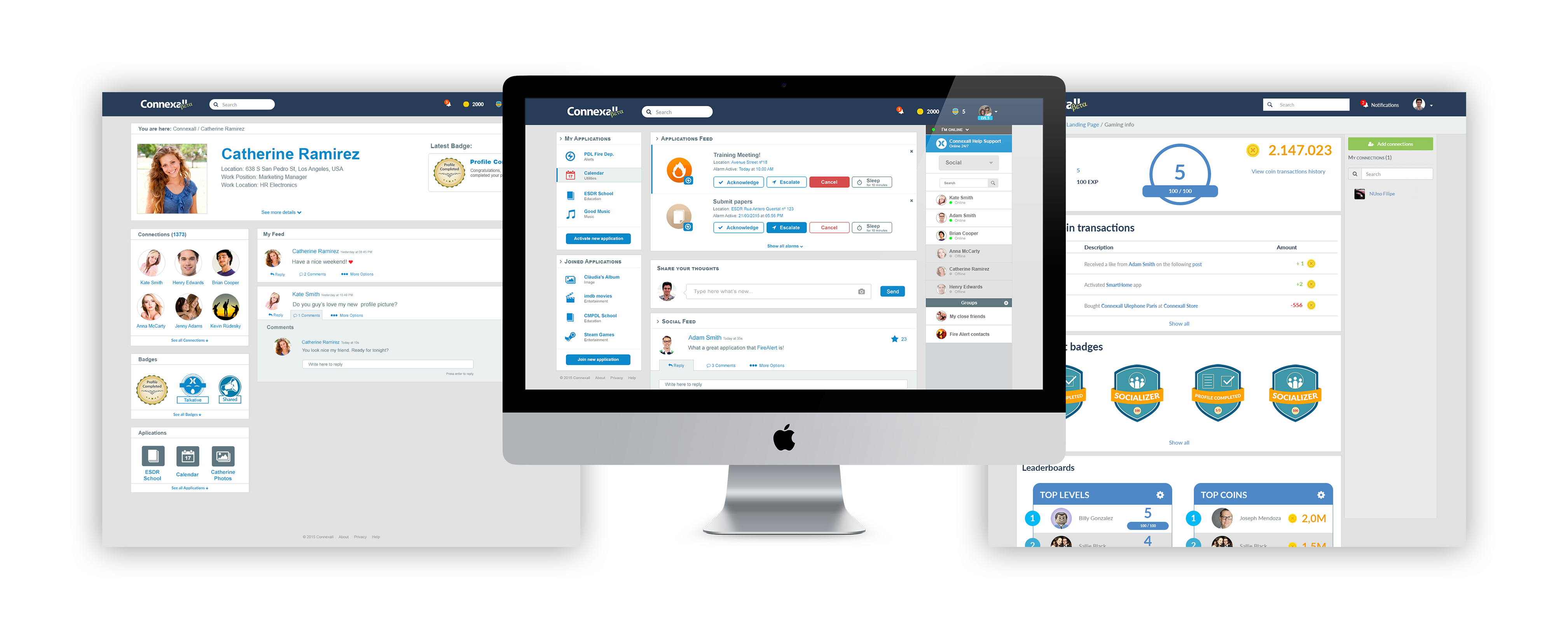
This pivotal stage marked the transition from conceptualization to tangible fruition, evolving the project from sketches and wireframes into high-fidelity mockups and prototypes. The collaboration intensified with the addition of a new designer to the team.
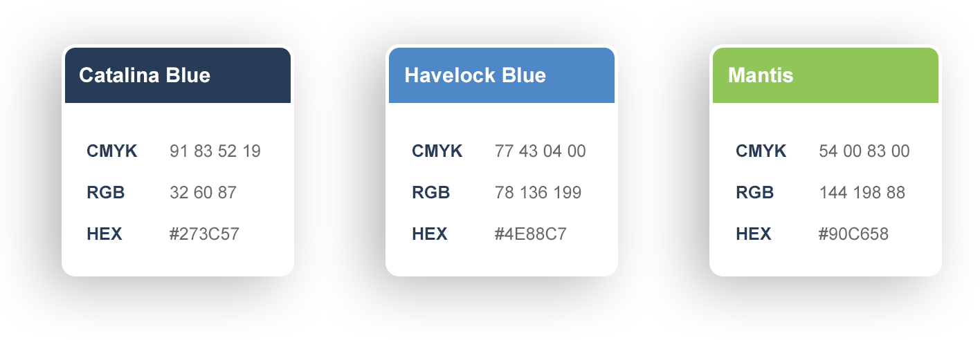
Choosing a color scheme reflective of Connexall's branding, we incorporated "Catalina Blue" as the main theme color, contrasting it with a lighter "Havelock Blue" and a vibrant "Mantis Green" for specific interactions like buttons.
Typography played a crucial role, and we opted for the "Lato" font family, employing a combination of regular for normal text and bold for titles and highlights.
Lato Regular
abcdefghijklmnopqrstuvwxyz
abcdefghijklmnopqrstuvwxyz
0123456789
Lato Bold
abcdefghijklmnopqrstuvwxyz
abcdefghijklmnopqrstuvwxyz
0123456789
The comprehensive mockups were meticulously crafted, culminating in the development of deliverable assets and the implementation of templates using Phalcon PHP and AngularJS, employing HTML and SASS. This phase not only solidified the visual identity but also laid the groundwork for the subsequent steps in the project.
6 - Quality Assurance
Importance of quality assurance and quality control
Quality assurance, a fundamental step in the development process, plays a dual role for both developers and product designers. While developers focus on code cleanliness and performance, quality assurance becomes an essential stage for product designers to conduct user testing and gather valuable feedback on usability.
Throughout the Connexall project, the importance of both user testing and quality assurance was acknowledged but often sidelined in various stages. This decision had a profound impact on the project's ultimate outcome.
In an ideal scenario, quality assurance would have served as an opportunity not only to ensure technical robustness but also to refine and enhance the user experience. The collaborative efforts of the development team and the product designer during this stage could have addressed potential issues, improved performance, and ultimately contributed to a more polished and user-friendly product.
Unfortunately, the oversight of this crucial step resulted in missed opportunities for refining the project and meeting user expectations more effectively.
Final Product
Reflection
What was done right
As a cohesive team operating under tight deadlines, our endeavor to develop and implement a social network platform proved successful. This platform, designed as a foundational environment for various apps, showcased our adaptability and resilience. Despite the evolving project scope since its inception, we successfully incorporated numerous desired features, including app activation, user chat, social feed, gamifications, and more.
What could have be done differently
In retrospect, the project's ultimate challenge stemmed from a combination of insufficient investment and ambitious expectations for a small team with budget constraints. The decision to skip comprehensive user testing and quality assurance, especially during critical stages, had far-reaching consequences. Proper user testing and quality assurance could have focused critical insights, addressed potential issues in a timely manner, and fortified the project's foundations.
An insightful lesson emerged. Had we invested more time and resources in user testing and quality assurance, many of the challenges encountered in later stages could have been preemptively addressed. This realization underscores the critical importance of thorough testing, validation, and user feedback in the iterative design and development process.